One World Solar

CLIENT
DELIVERABLES
ROLE
DATE
CLIENT

Lorem ipsum dolor sit amet, consectetur adipiscing elit. Proin sed libero libero. Donec ultrices massa elementum lacinia suscipit. Etiam iaculis, erat vitae pretium pulvinar,

client

Lorem ipsum dolor sit amet, consectetur adipiscing elit. Proin sed libero libero. Donec ultrices massa elementum lacinia suscipit. Etiam iaculis, erat vitae pretium pulvinar,

/01 CONCEPT

BRAND

One World Solar is positioned as a forward-thinking, globally conscious solar company rooted in Singapore’s innovation and sustainability agenda. The identity balances clean energy optimism with technical reliability, using the sun-and-grid mark to symbolise both natural power and engineered precision.

The bold yellow palette evokes energy, warmth, and accessibility, while the structured typography and geometric iconography reinforce trust and professionalism. As a concept, it successfully bridges environmental impact with commercial credibility, making solar feel both aspirational and attainable.

/02 Marketing

COLLATERAL

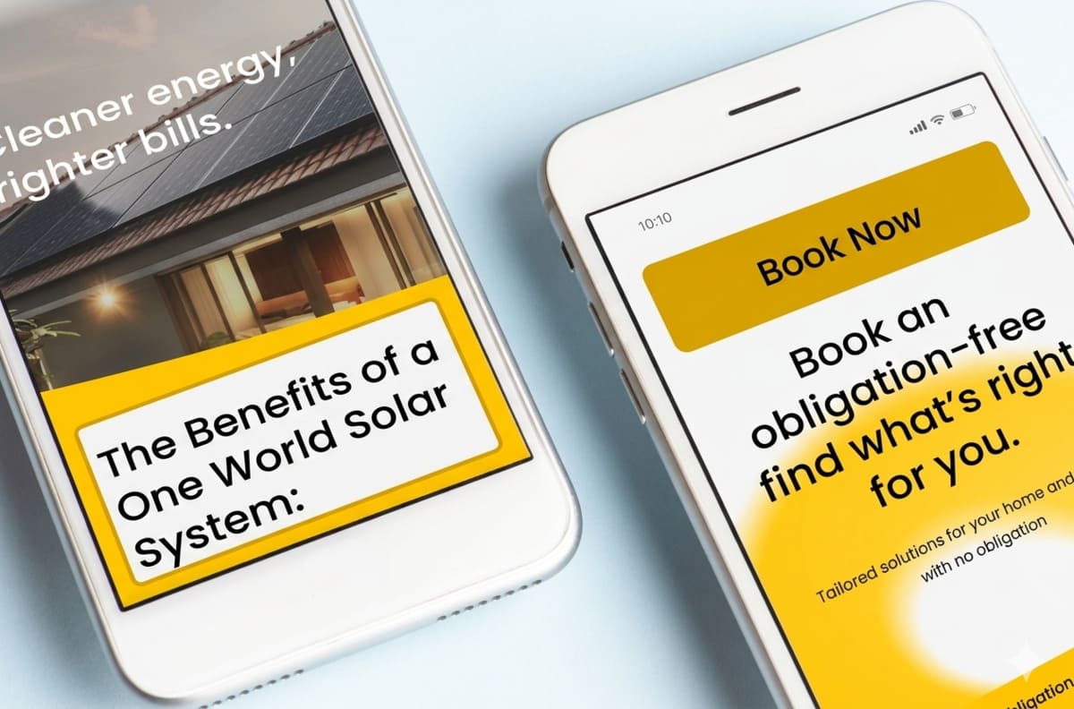
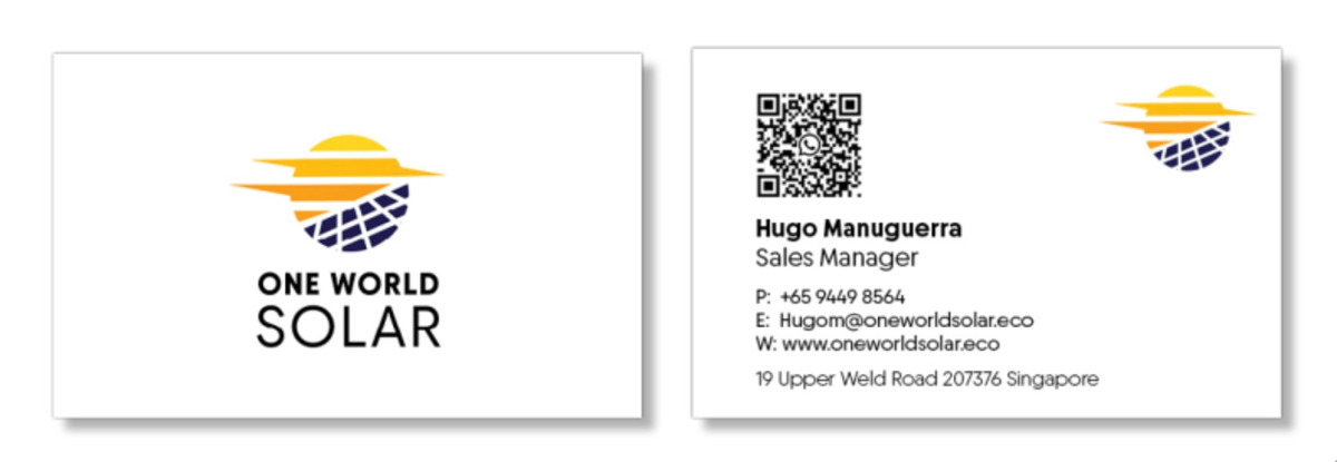
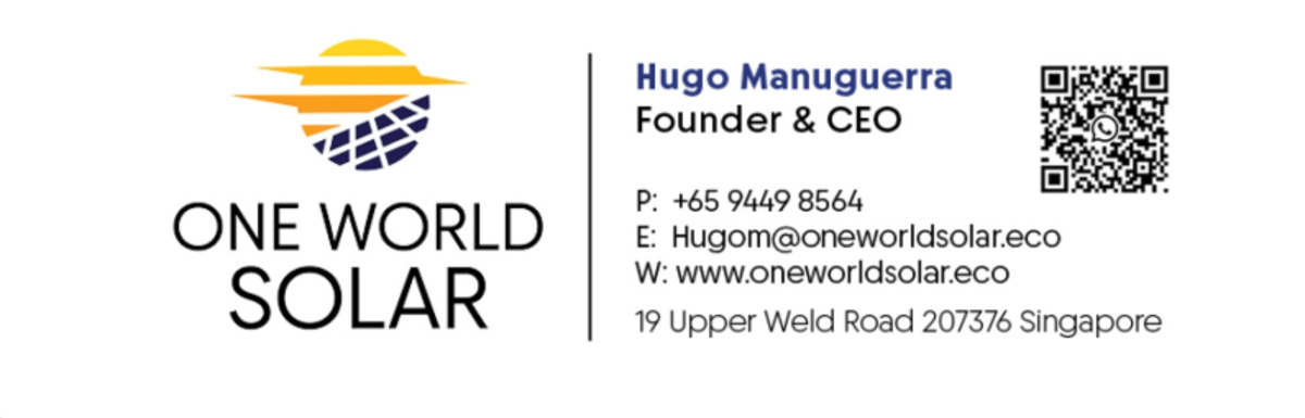
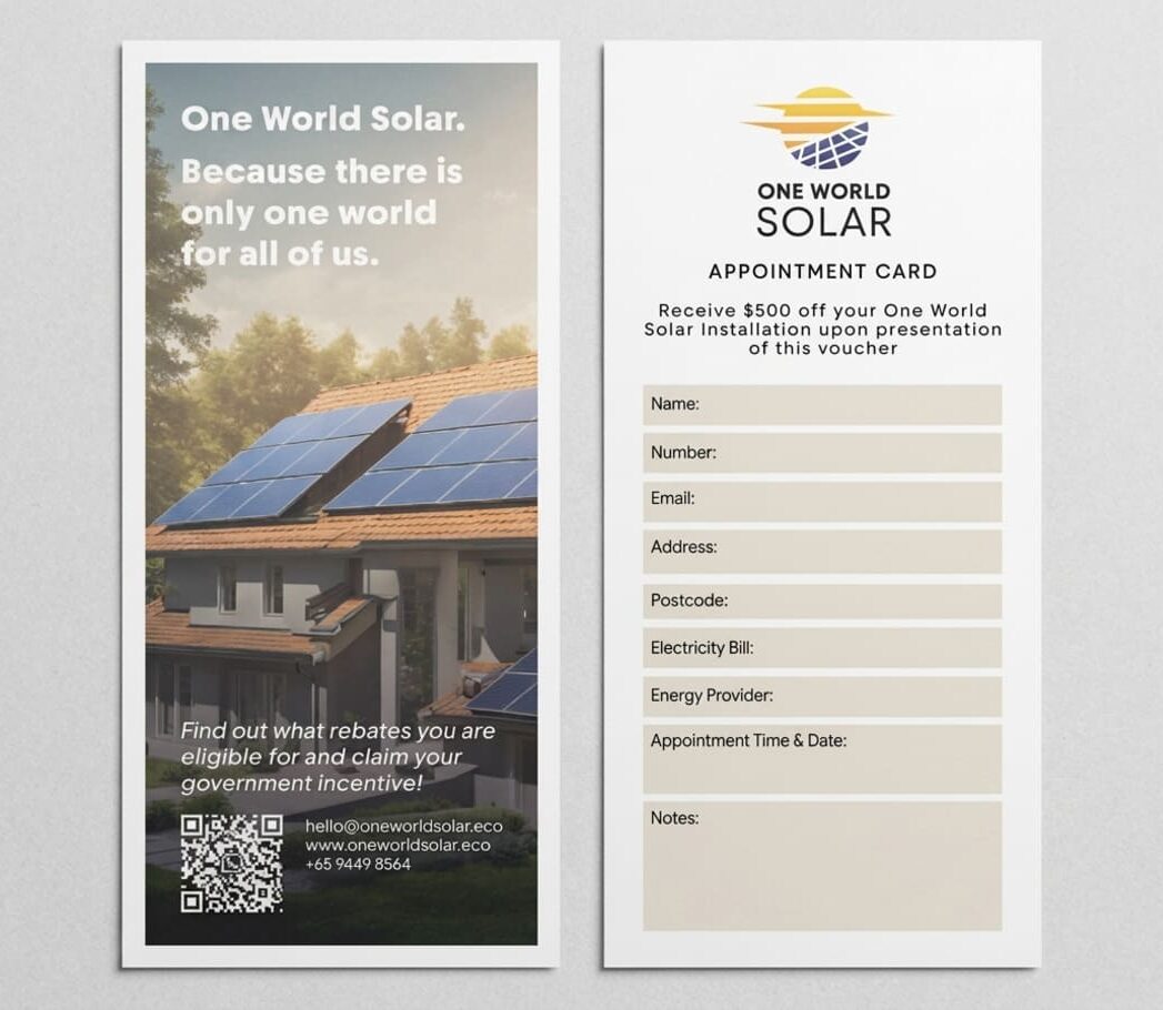
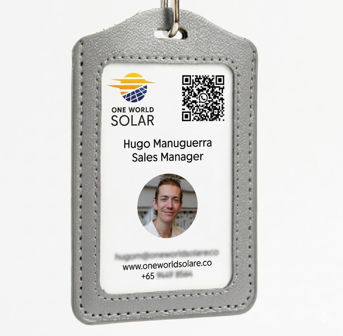
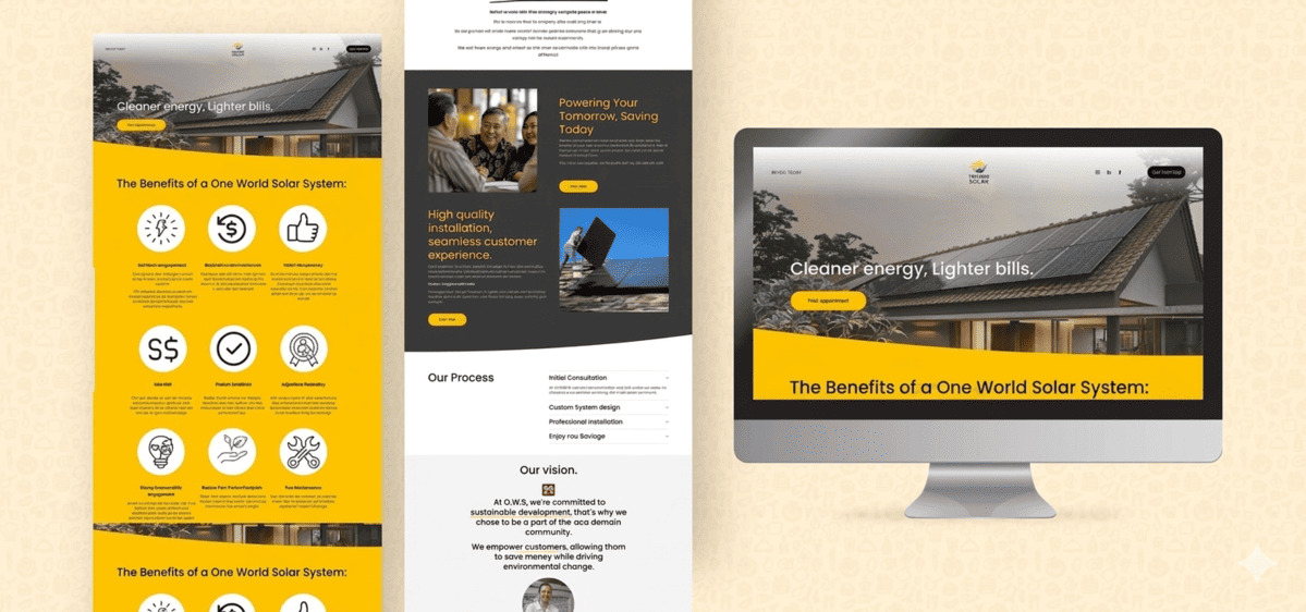
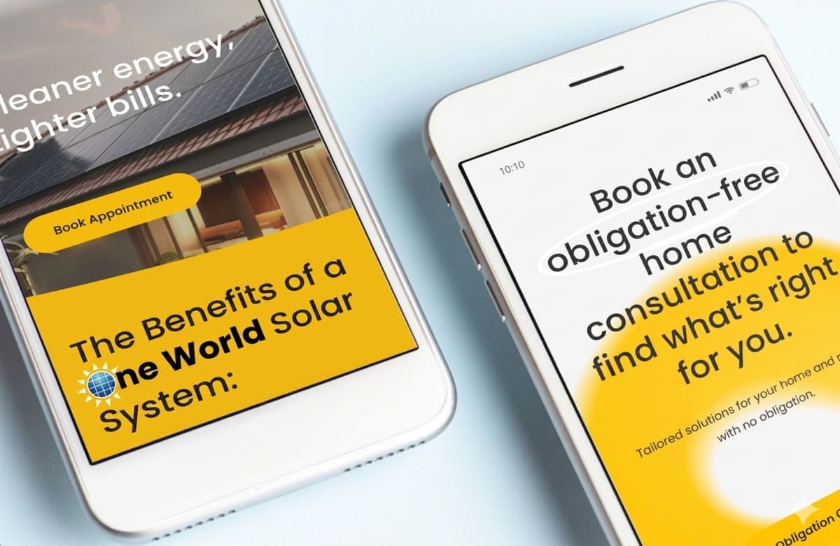
The collateral suite for One World Solar creates a cohesive, high-trust brand experience across every physical touchpoint. From business cards and ID badges to brochures and appointment forms, each piece is designed to reinforce credibility, clarity, and professionalism. The consistent use of bold yellow accents, clean layouts, and structured information ensures immediate recognition while maintaining a modern, accessible feel.
Importantly, the materials are not just aesthetic — they are functional sales tools, guiding conversations, capturing leads, and supporting on-the-ground interactions. Together, the collateral positions One World Solar as a polished, reliable, and customer-focused brand, strengthening trust at every stage of the customer journey.
/03 PRESENCE

WEBSITE

The website extends this positioning into a clear, conversion-focused digital experience. It combines high-impact visuals with structured information, guiding users from awareness to action through benefit-led messaging, simplified process breakdowns, and strong calls to action.
The use of bold colour blocking and modular sections helps prioritise key information, while mobile responsiveness ensures accessibility across touchpoints. Overall, the site communicates clarity, confidence, and ease, reducing friction in what is often a complex purchasing decision and positioning the brand as a reliable partner in the transition to clean energy.